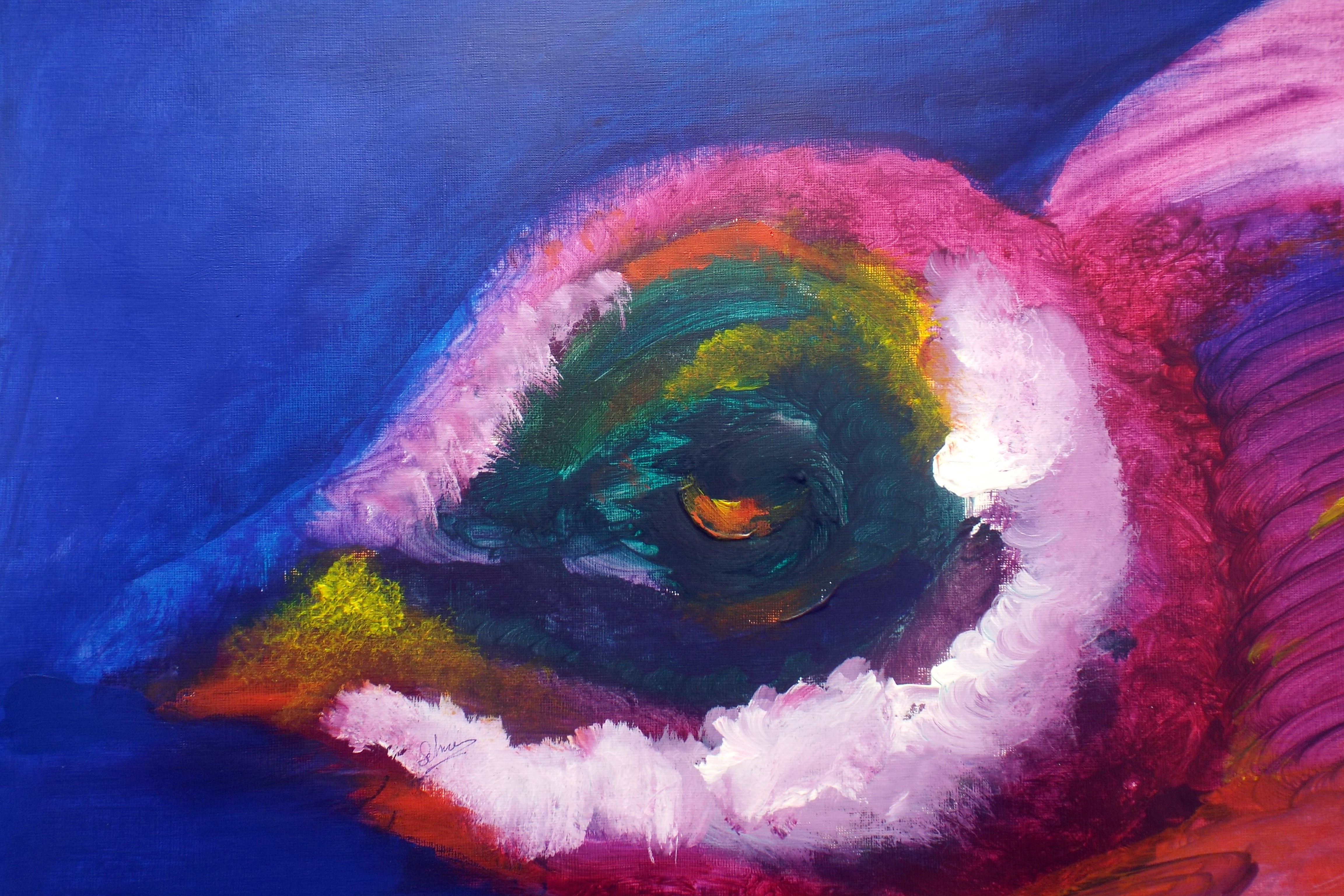
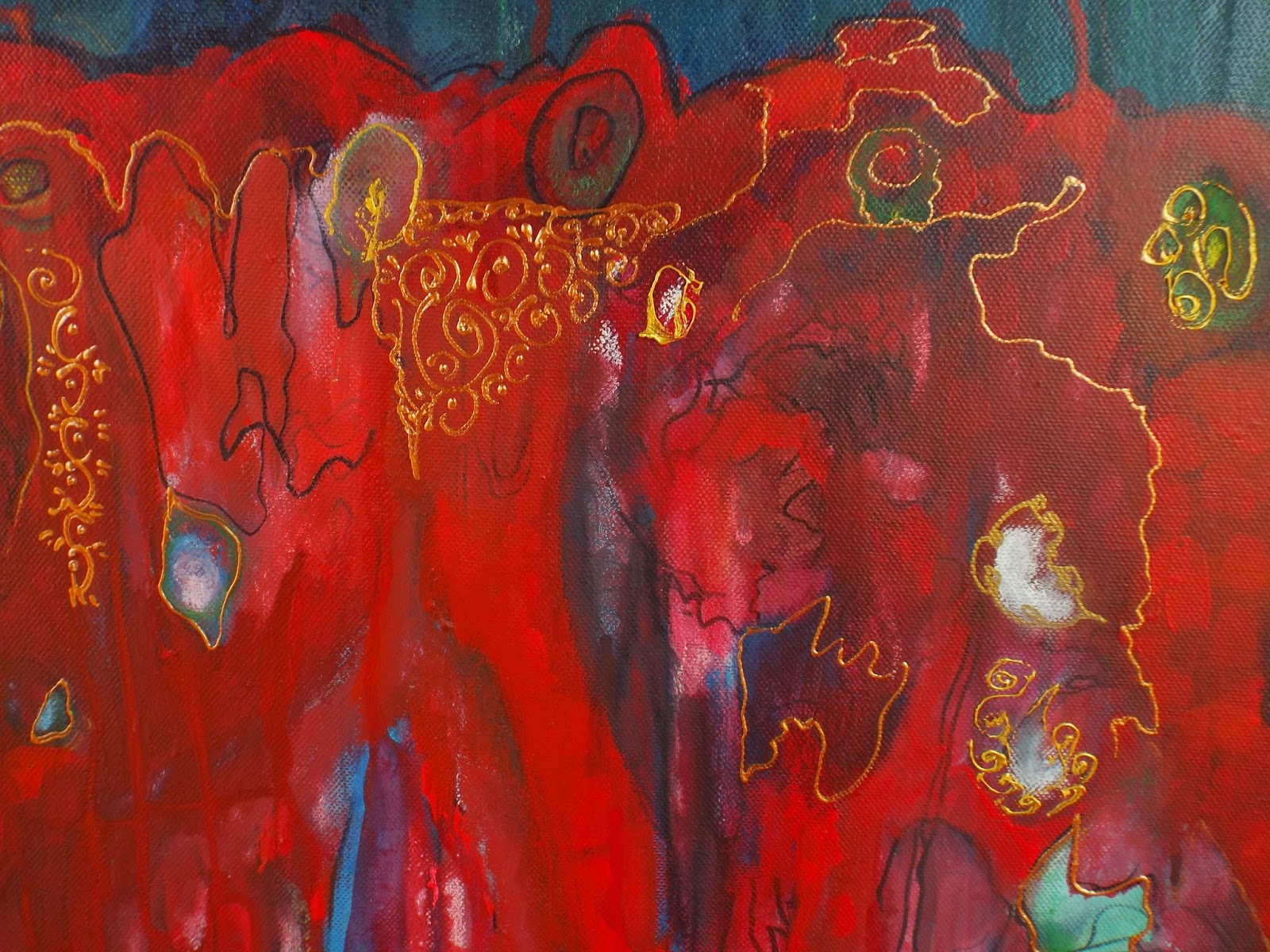
Medium:Acrylic painting on canvas paper Size: 20 x 16 inch/ 50.8 x 40.5 cm Colours:Orange,Red,Green,Blue and White with different colour’s tones and values. Date: 2014 Artist: Selma Awadalla Fine Artist
Title: “The riverside picnic”
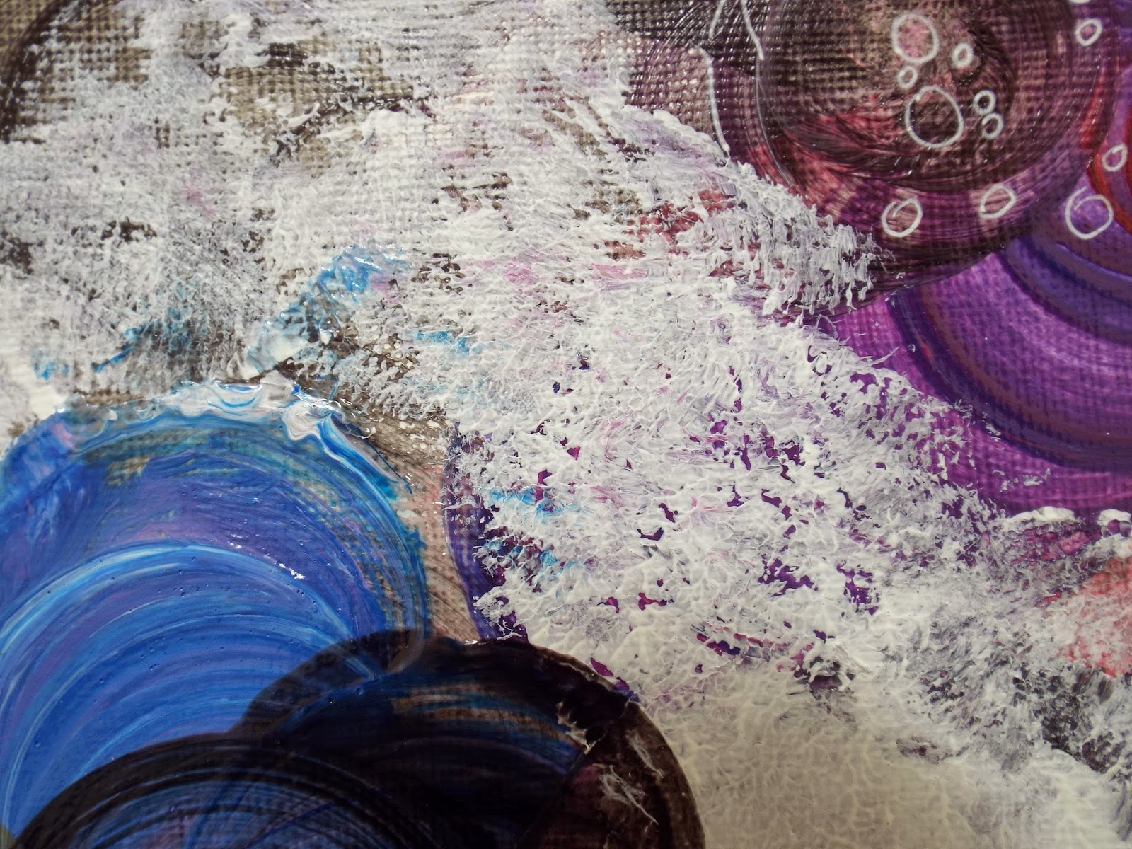
Abstract acrylic painting forsale
2014 art
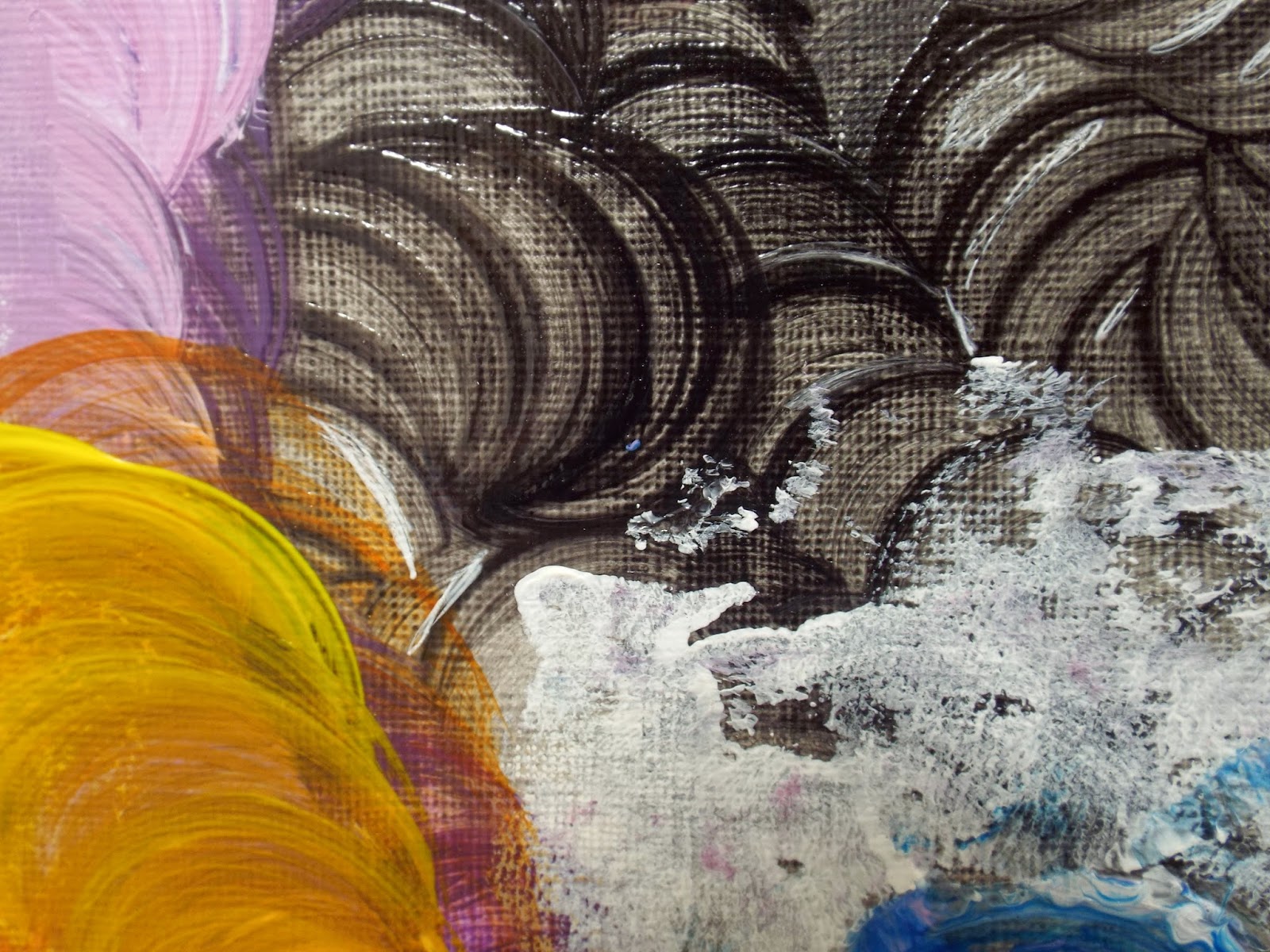
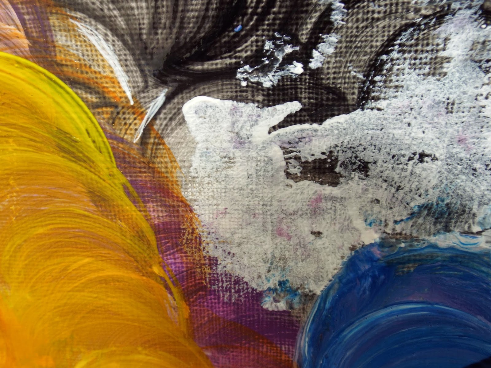
size: A2(23.38 x16.5 in/59.4 x 42 cm)
Acrylic painting on paper
Dominant colours: white,blue,gray and brown
signed on the front, signed and dated on the back
offered unframed
Should the art suit the room or the room suit the art?
Any artist would prefer that everyone buy the art they love and then find a place to put it. If you feel strongly about a particular work of art, this is certainly the way to go. But you may find that when you get the art home and place it on a wall, it doesn’t work with its surroundings. ‘Not working’ means that the art looks out of place in the room. Placing art in the wrong surroundings can diminish its beauty and impact.
What should you do if you bring home a painting you love and it clashes with its environment? First, hang the painting in various places in your home, trying it out on different walls. It may look great in a place you hadn’t planned on hanging it.
If you can’t find a place where the art looks its best, you may need to make some changes in the room, such as moving furniture or taking down patterned wallpaper and repainting in a neutral colour. The changes will be worth making in order to enjoy the art you love.
The right lighting is the key to showing art at its best. You may find that placing a picture light above a painting or directing task lighting on it is all the art needs to exhibit its brilliance. If you place a work of art in direct sunlight, however, it may well fade. Pigments such as watercolour, pencil and pastel are especially prone to fading, whereas acrylics are not.
I’ve often heard said that art doesn’t have to match your sofa (or your room, for that matter). The thought is that the la-tee-dah art is so much more important that your furnishings and other decor that making sure it matches is an insult. I believe it’s an insult not to consider the size, shape, and colors of the art when choosing it for a space. Don’t you read more: